In doing some initial reconnaissance work for the upcoming University of the Arts Teaching with Primary Sources Summer 2021 online course A is for Everything: How Typography Shapes our Language and Culture, I was guided to the Netflix documentary called Abstract, The Art of Design, a multi-episode series focusing on artists and designers from across mediums. One particular episode featured world-renowned typographer Jonathan Hoefler and his methodical approach to typographic design. I was captivated with how his creative designs have permeated our world, from his work with Apple to political campaigns and beyond. This then led me to the episode featuring the graphic designer Paula Scher and her use of typography in her designs and collaborations with some of the greatest talents in NYC, from her work with the Public Theater to her work on album cover designs from the world of rock (see Bruce Springsteen’s Darkness on the Edge of Town) and jazz to her own obsessive work with cartography. My one take-away from learning about these two very important luminaries in the world of textual design: that font design and typography are all around us; and a great deal of work goes on behind the scenes to make textual design one of the quintessential means of communicating ideas and mood throughout not only the world of design but also of the mundane and real-world features of life all around us--in historical documents, advertising, branding, music, menus, signage, on buildings, sports uniforms, print publications, and so much more. The art and processing of printed textual design has existed long before its commonly associated beginnings with Johannes Gutenberg’s movable type in the Greek, Hebrew, and Egyptian letters that dominate our collective understanding of ancient forms of calligraphed communication. And now, as social media platforms continue to restructure and influence how we connect and communicate with one another, it becomes increasingly important to understand how the nuances of textual design remain such a distinctive feature in how ideas and language are processed and assimilated into our worldview. Typeface and typographic design does not happen in a vacuum - it follows a line of continuum that has existed for millenia and continues to evolve and reshape how we interact with our visual surroundings. Typography is not simply born out of putting a pen or pencil or woodcut onto the page - it comes from a historical understanding of how language and typeface reflect the society from which it emerges, as well as a true reverence for the written word and how it communicates a mood or feeling just like any other work of art. Designers like Hoefler and Scher approach their art as a surgeon does their craft, like a William Carlos Williams’ poem in the way it transforms the written word into a surgically precise modernist painting, painstakingly turning simple text into a living, breathing entity that encapsulates a new way of seeing. This, it seems, is what artists like Hoefler and Scher want us, as viewers and consumers, to see and experience: typeface and lettering is all around us and, if we look closely enough, we can appreciate the beautiful and bountiful intricacies that the written word can offer, both in terms of subtle and visceral evocation of emotions.
Now, as a high school language arts educator, I am always thinking about how some of my personal and intellectual passions and interests can best translate into my classroom, from surrounding my students with ephemera from my teaching life collections (posters, former student work, signage, etc.) to incorporating new ideas into future lesson and unit plans. Having been a past participant and now a certified instructional coach for the Teaching with Primary Sources Program at the University of the Arts in Philadelphia, I have had the benefit and pleasure of working alongside many creative individuals who have illustrated how primary sources within their art mediums have served as the backbone for many creative processes in the worlds of Comics and Graphic Novels, Photography, WPA Poster Art, Botanical Illustration, Book Art, and, most currently, Typography and how it shapes our language and culture. These TPS courses have not only given me, as an educator for 20 years, a myriad of resources from which to build new content ideas; but they have also challenged me with new ways of seeing and interpreting the world. Most importantly, this is what I would like to bring to my students once completing a round of summer courses at UArts: Life all around us is ripe fruit for the picking if one takes the time to look closely enough and primary sources are not simply relegated to library research and investigation. That is one critical foundation of the TPS Program at UArts as a consortium member of the Library of Congress TPS program - primary sources in every medium can offer endless learning opportunities and possibilities for deep observations and inquiry, collaboration and critical thinking. The University of the Arts/ Library of Congress Teaching with Primary Sources Teacher Resource Guides are just a few examples of how the exploratory work in these courses can offer new perspectives and teaching opportunities for educators and are invaluable in the scope they provide for the use of primary sources in all subject areas.
The aforementioned courses were born out of a grant from the Library of Congress’ Teaching with Primary Sources Program and continue to serve educators with purposeful and relevant subject matter that not only support Common Core standard instruction but support the investigative, collaboratively rich, critically thinking approach to learning that is essential for our students surrounded by mostly virtual and, in many cases, isolated learning during this past year. Moving forward, opportunities to engage students in deep exploration and investigation of primary sources can be the key to more meaningful and sustained learning.
The Library of Congress is a great place to begin some deep research into content that helps support educational goals for class lessons and/or units of study. With some patient and flexible search approaches on loc.gov/Teachers page, one can discover amazing possibilities for typographic design examples to show students how diverse and storied typographic art has been throughout the ages, as well as the visual imprint it has left on society. The “Getting Started with Primary Sources” page provides the prospectus and framework for contextualizing the found materials, while the Classroom Materials at the Library of Congress page offers the Primary Source Sets that can be used for whatever target lesson is appropriate at the time, in this case how typography - literally and figuratively - shapes the world in which we live, and has for centuries.
As baseball’s Opening Day was yesterday, April 1st, 2021, I was inspired to search through the LOC’s Primary Source Set entitled “Baseball Across a Changing Nation” and found some fantastic typographic design featured in sheet music and comic book cover art, as well as on an actual World Series ticket from the 2016 Game 7 Cubs vs. Indians historic game from the Baseball Americana exhibit. This then led me down the rabbit hole to baseball’s “Magna Carta” 1857 original rules document and the typeface used in John Newbery’s A Little Pretty Pocket Book from 1787, which may provide the first American reference to baseball. These pieces of baseball memorabilia show just some examples of typeface that reflect historical typographic design in America.
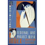
Delving further into the annals of the Library of Congress’ holdings, my search for identifying examples of typographic design brought me to the WPA Posters collection, which features more than 900 items from 1936-1943, when artists were commissioned through FDR’s New Deal to design posters promoting “exhibits, community activities, theatrical productions, and health and educational programs.” What struck me was the range and scope of high artistic design aesthetic for such simple and utilitarian purposes as raising awareness of getting a blood test and examination to control the spread of syphilis to educating the public about the benefits of proper health and hygiene in New York’s tenements. These examples and more in this important collection highlight how these commercial pieces were designed to raise public awareness but, in turn, transformed posters into true “art,” inspired by the leadership of Richard Floethe, an industrial designer and head of the New York poster division “who was educated in the fundamentals of the aesthetic movement known as the Bauhaus.” Under the leadership of Floethe, I learned, artists were able to freely experiment with bold colors, imagery, and typographic design.
These two collections are just the drops in the bucket of deep exploration one can find oneself on when searching the LOC digital collections. Here, I started on my TPS Typography classroom preparatory journey with a Netflix documentary (which I highly recommend for anyone with even a nominal interest in design) and continued through the writing of this post with link-hopping the many visual digital artifacts in the LOC primary source sets. Both the documentary and the visual examples can be used with the Primary Source Analysis Tool for student investigation - both individually and collaboratively - in a live, in-person (now, seemingly a novel idea) and/or a virtual Zoom learning space.
Circling back around to the artist and designer Jonathan Hoefler and his online typeface foundry, I was amazed by the nuances of typeface used in his cartography collection and how these contemporary designs have been inspired by centuries of mapmaking. In a throw-a-pebble-in-the-pond-and-follow-the-ripples moment, Hoefler’s work brought me back around to the map collections in LOC, offering an extraordinary look into the history of mapmaking from throughout the world, from some of the earliest portraits of America to one of the earliest maps of Philadelphia, just east of where our host institution - University of the Arts - is located and from where our TPS Summer 2021 Online Courses will be offered.
Images:
MLA citation style:
Chicago Cubs vs. Cleveland Indians World Series ticket, 2016. Reproduction. Courtesy of the National Baseball Hall of Fame and Museum (020.02.00)
Diary of John Rhea Smith, Nassau Hall, College of New Jersey. Princeton, 1786. Manuscript Division, Library of Congress (004.00.00)
Easburn, Benjamin, and Georges-Louis Le Rouge. Philadelphie. [Paris, Chez Le Rouge ?, 1776] Map. Retrieved from the Library of Congress, <www.loc.gov/item/gm71002154/>.
Gutiérrez, Diego, Active, Hieronymus Cock, and Lessing J. Rosenwald Collection. Americae Sive Qvartae Orbis Partis Nova Et Exactissima Descriptio. [Antwerp: s.n, 1562] Map. Retrieved from the Library of Congress, <www.loc.gov/item/map49000970/>.
Help your neighborhood by keeping your premises clean Tenement House Dept. of the City of New York: F.H. La Guardia, Mayor: Langdon W. Post, Commissioner. [New York: Federal Art Project, or 1937] Photograph. Retrieved from the Library of Congress, <www.loc.gov/item/98513680/>.
John Newbery. A Little Pretty Pocket Book. First American edition. Worcester, Massachusetts: Isaiah Thomas, 1787. Rare Book and Special Collections Division, Library of Congress (005.00.00)
Norworth, Jack, and Albert Von Tilzer. Take Me Out to the Ball Game. The New York Music Co., New York, monographic, 1908. Notated Music. Retrieved from the Library of Congress, <www.loc.gov/item/ihas.200033481/>.
Stamp out syphilis Every baby is entitled to be born healthy: Blood test & examination should be made before marriage by your doctor or Bureau of Social Hygiene Clinic, 51 Stuyvesant Place, Staten Island. [Nyc: works progress administration federal art project, between 1936 and 1938] Photograph. Retrieved from the Library of Congress, <www.loc.gov/item/98518378/>.
9 - 12 13+ Art/Music English/Language Arts Library Social Studies/History
Replies displayed by creation date
Eric, your intellect and the depth of your curiosity always shines through in your writing and teaching. I always feel like you have the luckiest students!
The typographical samples you site are all so interesting. I especially love the sheet music for Take Me Out to the Ball Game that you cite

Notice the extra loop in the J of Jack.
It's great that you are facilitating the Typography class at UArts this summer, and since it's online this year, teachers from all over the country are able to attend.
What agreat resource. I am going to check that out! Thanks.
Testimonials
- I love that there is new info on the site daily!
- I had a wonderful time working with the Library of Congress and learning about all of the resources at my fingertips!
- The TPS Teachers Network has an equal exchange of ideas. You know it's not a place where you're being judged.
- My colleagues post incredibly fine resources and ideas....the caliber of the suggestions and resources make me feel that I take a lot from it. It's a takeaway. And I hope that I can give back as much as I get.
- Going into this school year, I have a fantastic new resource for my own instruction and to share with my colleagues!
- I am very glad that I discovered the TPS Teachers Network through RQI. Great resources can be hard to find out there on the internet!

