As it was stated in the introductory video History of Typography, "Type is Power!" And as graphic designer Ellen Lupton states, "Typography is what Language Looks Like." Using these ideas as your guided inspiration, use your inquiry-driven investigation to explore the many resources found in the Library of Congress "Free to Use and Reuse" / "Primary Source Sets" / "Digital Collection" pages to begin to hone in on selections that you find connected to the power of typeface in communicating ideas and messages to audiences from across the ages. In your discussion response, be sure to include the links to the found images/sets/collections that you are referencing. How might you use these in your classrooms and/or in your respective areas of work? English/Language Arts Social Studies/History Technology 9 - 12 6 - 8 3 - 5 Special Education bestof
Replies displayed by creation date
Click here to see the three LOC images I reference in this post
If “typography is what language looks like,” the grandiose design of the text used in, on, and around movie theaters from the birth of cinema through the middle of the 20th century was a way to communicate the scale and wonder of movies. Just by looking at the text used on theater marquees and posters and even inside of the theaters, you knew that going to the movies was a big deal.
Take the neon “Tower” sign on the Tower Theater built in Sacramento in 1938; it is written vertically at the highest point of the marquee, “towering” over the city. The glowing neon text appears to be written eight times around the peak, so it can be read from any direction. It is a glowing beacon signifying the importance and largess of going to the movies.
Then there is the lantern slide projected in early movie theaters in 1907 stating “if you expect to rate as a gentleman you will not expectorate on the floor.” This is an early ancestor of the modern reminders to turn off cell phones when at the movies. Movie theaters were still very new in 1907, so this message to not spit on the floor is targeted at the first cinema-goers. It’s existence implies that cinema owners were concerned that their theaters would attract a crowd with poor manners. It attempts to brand movie theaters as fancy places attended by gentlemen and gentlewomen, instead of places for floor-spitters. Even the typography evokes fanciness.
Building on this idea that movie theaters are meant for fancy nights out is the 1896 poster for Edison’s Vitascope technology. The text on the poster is large and brash, symbolizing how big Edison’s movies could be projected and highlighting the importance of the new technology. It is interesting that Edison’s name is almost the same size as the word “Vitascope”, and it is written above it, as the public was probably more likely to recognize his name rather than the name of the Vitascope. Notice the people in the crowd - they are dressed in formal attire to show that they are certainly not the kind of audience who would spit on the floor.
All three of these items link fancy and large text to the cinema, to advertise to the public that movies are a classy event and the technology used to create and screen movies was new and marvelous.
I teach a Digital Animation class. By the end of the course, my students are using Adobe Animate to create cartoons. Throughout the course, we learn the history of American animation and work our way up from pencil-and-paper to digital tools. The most important moment in the transition from flipbooks and mechanical animation devices like the zoetrope to the modern cartoons we see on TV and movies today is the rise of the cinema. We discuss the “fanciness” of going out to the movies in the early-to-mid 20th century, and compare that to the casualness of modern movie-going. These items from the LOC will be powerful resources for my students to explore to hammer home this idea of the sense of awe that early movie-goers experienced.
Thank you, Tyler, for your thoughtful and detailed response! Great commentary.
Wow! This deserves a round of applause.

Please Applaud With Hands Only. , ca. 1912. Photograph. https://www.loc.gov/item/2012645951/
I look forward to seeing what you do during this course.

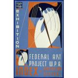
I found this bookmobile poster to be very eye-catching curtesy of the colors in the traffic light and its slant away from the largest most noticeable word, “CURB”. I had to continue reading when the first thing I saw was “CURB SERVICE”, “10,000” and “FREE”. Doesn’t that appeal to everyone?
Even if there isn’t a commercial benefit here, (there seems to be due to the design similarity to grocery and retail store advertisements from the time) a public service announcement for the Chicago Public Library is a priority for the community. The urgency and public appeal is very clear in the design leading one to try the bookmobile service.
This poster could easily be used to have students use typography and design to entice others for public or community service announcements. Word choice, font choice layout and urgency would be part of the list of objective concerns that will lead to a proper assessment of the project.
Federal Art Project, S. Curb service 10,000 current books - convenient, free, time saving: Chicago Public Library, Randolph St. corridor. Illinois Chicago, None. [Chicago: illinois wpa art project, between 1936 and 1941] [Photograph] Retrieved from the Library of Congress, https://www.loc.gov/item/98508385/.
It's interesting to see that libraries were providing some kind of curb service back in the 1930s!
Adding images to posts is different than the method for adding them to albums. For a post, go ahead and click on the "download" button just below the image in the cataloging record on the Library website. If you select a jpeg, you will get a url for just the image. You can put that URL in the Source field of the "insert/edit image" tool in the Network discussion.
I am framing my selections in the context of what I might share with my beginning level Design students.
https://www.loc.gov/resource/mussuffrage.mussuffrage-100027/?sp=1&r=-0.04,0.036,1.157,0.472,0
This example is illustrative of several key concepts of how typeface communicates meaning. I would ask my students to identify and describe the visual hierarchy created by the sizes and colors of the text. I would ask them to reflect the typeface and color used for the dedication to Emeline Pankhurst, and compare that to the typeface choices for the other smaller bits of information on the page. Discussions could also be had about the choice of typeface for “Votes for Women,” being that it is a piece of music. Something different would have been chosen for a newspaper headline, for a poster, or other promotional material. It would be fun to see the typeface choices students might make for the same words but in different contexts.
https://www.loc.gov/resource/cph.3a26270/
In terms of visual hierarchy and with regard to making meaning VERY (shoutingly) clear, this image speaks volumes. The most important words, “Opposed to” are very large and plain so as to not be missed or misread in any way. This is in contrast to the slightly more decorative words, “Headquarters, National Association.”
I was also particularly interested in some images in the primary source sets for the states.
https://www.loc.gov/resource/cph.3b49048/
Here, Design students can discuss color scheme, division of space, leading of lines, and emphasis. The word “Flight” looks like the idea of streamlined movement and speed associated with airplanes. Further discussion could be had regarding the color of the letters, including the white outline against the navy blue of the plane. (P.S. I am also reminded of Roy Lichtenstein!)
https://www.loc.gov/resource/cph.3b48724/
Similar to the “Flight” example, this image could inspire discussion of many design elements. Looking at typeface in particular, we could examine the different choices made for the “Mobilizing Michigan” heading and the words “for farm and factory.” Students might discuss why the word “Michigan” turns the corner and contributes to an implied rectangular boundary--and how the poster might read differently if all the text were horizontal.
https://www.loc.gov/resource/cph.3g08356/
This is another piece that is definitely shouting. Great urgency is being conveyed by the wording, frequent use of the exclamation point, and size and boldness of select words. Yellow was chosen for a reason for the main heading. “Quality is poor” is shown in larger letters than the rest of the line. “SEED” is in all capital letters so we don’t miss that key element. (This reminds me of writing emails to my students where I make things big, bold, and colorful because I know they won’t read the whole email.) I also just think it’s funny that Uncle Sam is pointing to the corn, just in case we didn’t already get the message. Although this is a WWI era message, and I don ‘t even grow corn, this poster leaves me feeling a little guilty about my frivolous use of corn.
Lastly, this is just funny to me and I just might print it and hang it in the classroom: https://www.loc.gov/resource/var.0954/
“Mistakes WILL Happen.” I love the accent on the word “WILL,” due to its larger size. I am also interested in the word “mistakes,” as it looks imperfectly drawn.
These are all so thoughtful. I especially like your discussion of this image

I might have assumed that the way "National Association" is squished in the upper right, forcing the viewer to try to make sense of the word order, was a mistake or thoughtlessness on the part of the sign-maker. You encourage me to ask if that's a strategy instead, and consider how word placement affects the message. Great fodder for inquiry!
Haha! Maybe the sign-maker did forget to include "National Association!"
Your comment about word placement reminded me of a rerun of a Modern Family episode we watched last night, where Phil got a real-estate advertising wrap applied to his minivan, but the way it was wrapped around the sides and back of the vehicle made it look like he was advertising call-girl services.
I plan to use the LOC collections as inspirational jumping off points for my Digital Design students, for their original projects. For example, we do a project called "Posters for Social Change" where each student selects a topic they are interested/passionate about that is related either to identity and/or social justice. They research this topic and then design their own poster with typography, illustration and/or photography.
The LOC collections can be used to show examples of finished pieces that are similar to this project, as well as for stylistic and visual inspiration that is applied to a totally different topic.
Some examples I found include:
- Poster Parade Collection
- WW1 Poster Collection
- Travel Poster Collection
- WPA Poster Collection
- 2000s posters in the collection (via search)
- 1960s posters in the collection (via search)
- Students can search for other decades or using other criteria
Students will search the collection and then select one or more inspirational pieces, then sketch and iterate based on that style, but using the contemporary topic they selected.
In addition to the LOC collections, I really like this website for typeface and design inspiration, and use it frequently for my own projects and for student inspiration:
Thanks so much for including your search of 21st century posters. It's a good reminder that the Library is a living institution, collecting contemporary primary sources that help us understand our present day, and how we make sense of our past.
This is fantastic! As a lover of poster art throughout the decades, I've used several of these pathways in my class to explore how poster art from the past could inform students' decisions about creating poster art reflecting contemporary themes and social justice issues. Drawing (literally) from the past to impact the present. Great selections!
I am teaching a video production class and am interested in having my students do a project on how titles and credits set expectations for a movie audience.
I was thinking of opening the lesson with an activity that looks at some of the travel posters (click here for collection) and ask the students to analyze how the typeface sets the experience or expectation of experience for the traveler.
I would focus on three posters: Puerto Rico, Montana, and Yellowstone (click here to see the album). After discussion I may ask students to choose another poster from the collection and have them change the font and explain how that would change the overall tone of the poster and essentially the trip as well.
The way you put it -- setting expectations -- is great. I would love to see what those three posters looked like with completely different typefaces. Very creative project!
I was keeping my elementary students in mind during my search through the LOC source sets. It took awhile for me to find some images that not only incorporated text but would also lend itself to the younger age groups. I found what I was looking for when I browsed through the WPA Posters in the "Free to Use and Reuse" collection.

This poster was created by a Philadelphia artist in the 1930's. The Philadelphia Zoo had already been open for quite some time at that point, so my guess is this poster served more as an advertisement for the zoo. I like the design of this poster-almost something you might see on a t-shirt today. The text is very bold and straight-forward. Ironically, no particular zoo is mentioned, which leads me to believe that this poster could have been mass-produced and displayed throughout the entire country, encouraging all Americans to visit their local zoos.

This poster made me smile. I know my students would absolutely love it. Another one created in the 1930's that is simple and to the point. The boldness of the text creates a nice balance to the line drawing of the figure in the center of the poster.

This final poster follows the same design method as the previous two: 1930's, simple message, bold text, easily applies to all states. The "let them grow" text refers to the notion of promoting conservation of flowers as a natural resource.
The 3 posters I chose to focus on would be ideal to analyze together with my elementary students. The images are vibrant and bright, the text is bold and simple. These images would be a great introduction to using text/words in art. We spend a lot of time on the elements of art, and these posters lend themselves to color, shape, form, space (and on and on..) as well.
Anytime I show my students artwork from the greats to contemporary artists, I always forget how much they love art history and looking at art. These posters would give them even more to consider and discuss, especially finding connections/similarities between the three posters.
It's great to hear how you would use these posters with elementary students. That Keep Your Teeth Clean one is so good!
Here's a fun connection,  Dawn Loizos
-
 Cheryl Davis
, who coordinates the TPS Teachers Network Mentor program, has done some really fun work with animating WPA posters, and she even animated the Keep Your Teeth Clean poster! Take a look here: https://vimeo.com/324715999
She has put all her animations into an Apple eBook. You can see them in the eBook or in her album here in the TPS Teachers Network: https://tpsteachersnetwork.org/tps-tech-talk/keep-your-teeth-clean-animating-posters When she first started experimenting with animations, she wrote a post HERE.
Don't hesitate to contact Cheryl if you'd like to try this out with your students.
Thanks  Mary Johnson
! The comments and links to posters in this discussion have been so interesting. I was inspired to try my hand at making animated gifs of a couple of the posters shared. Such a rich collection here and wonderful ideas.
http://loc.gov/pictures/resource/ppmsca.70230/
I chose a poster of Mount Rainier National Park. I absolutely love traveling and am currently in a National Parks phase. I think these vintage posters are amazing and when I travel, I purchase postcards and frame them.
Going through the Free to Use Collections, I liked some images from several groups. The museum where I am a Docent has a large collection of illustrations for books and magazines, so I liked the Book Art and Children’s Classics— especially the Baseball ABC to teach the alphabet through a topic of interest. I might look for other alphabet books to go with our Typography samples. Another picture caught my attention in Hats, to show how our attitude toward nature has changed and continues to evolve. Wearing a dead bird in one’s head would be almost illegal, and not fashionable but offensive. Many early children’s books are no longer socially acceptable, so i’m also interested interested in how values have changed over time. It is no longer cool to kill birds with a slingshot! I hope! And Christianity is no longer a central theme in children’s poetry. My lesson would be about how we revise our images and texts according to changes in values and behavior. People used think it was ok to be sexist, racist, and to underestimate and disrespect animals and people. If books can change over 100 years, how much might they change again in the future? Ideas need to be flexible toward inclusion— yesterday Is not today. Ideas are not static. How are stereotypes outdated? Compare and contrast over time to see regressions and progress of civilization.
Anne, you might be interested in joining the Partnering with Museum Educators and Archives Group as well.
I teach kindergarteners in Lancaster County, PA. One of our History standards is to "identify American people related to national holidays." Since my students last year loved learning about George Washington, Abraham Lincoln, and Martin Luther King, Jr. I decided to look through some of the Abraham Lincoln materials to look for primary sources to enhance our understanding of the 16th president.
A bold representation of type can be seen on this campaign banner when Lincoln successfully ran for president with his running mate Hannibal Hamlin in 1860:
https://www.loc.gov/resource/pga.01637/
Printed on cloth, this striking red, white, and blue flag banner uses blue ink for the lettering on the white stripes. ABRAM LINCOLN and HANNIBAL HAMLIN are printed in capital letters for emphasis. According to the Library of Congress Notes, the printer shortened Abraham to fit the design. I think it is interesting that there are periods after each person's name. Perhaps this adds emphasis to each individual and the office each is running for. My learners and I can look at the American flag hanging in our classroom to discuss the similarities and differences and why they think Abe Lincoln would have used a flag to help get elected.
Abraham Lincoln's handwritten draft of the Gettysburg Address is smooth and flowing, honoring the soldiers who died in battle; dedicating the battlefield "as a final resting place for those who died here, that the nation might live." His draft script matches the solemnity of the occasion. There are some subtle underlines and cross-outs, but his powerful words and thoughts are not bolded, even though they were bold...making history...giving us the ideal of "government by the people for the people, shall not perish from earth."
See: https://www.loc.gov/resource/mal.4356500/?sp=1&st=list
I will show my learners this draft speech and we can think about a president writing such important words. Then we can look at images of Gettysburg, and think about the time Abraham Lincon came to Pennsylvania to deliver his solemn yet powerful Gettysburg Address.
Print of Abraham Lincoln
https://www.loc.gov/resource/pga.02917/
This memorial print has ABRAHAM LINCOLN in raised block letters under his portrait. The typography reminds me of carved lettering on a gravestone. The print gives his birth and death dates, printed in black, as though stamped on the print. At the top of the scene is a partially draped coffin and the bald eagle as well as other funerary iconography, such as urns with flower swags. Around his portrait are important scenes of his life, including his assassination and the funeral procession.
I would use this to show my learners one way we remember a famous person's life. We can also look at pictures of the Lincoln Memorial as another, more lasting way that he is remembered.
Citations:
Campaign Banner:
Howard, H. C. (ca. 1860) For president, Abram Lincoln. For vice president, Hannibal Hamlin. , ca.1860.[Philadephia: publisher not identified] [Photograph] Retrieved from the Library of Congress, https://www.loc.gov/item/2003656570/.
Gettysburg Address:
Lincoln, A. (1863) Abraham Lincoln papers: Series 3. General Correspondence. -1897: Abraham Lincoln, November 1863 Gettysburg Address: Nicolay Copy. November. [Manuscript/Mixed Material] Retrieved from the Library of Congress, https://www.loc.gov/item/mal4356500/.
Portrait:
(ca. 1865) Abraham Lincoln. , ca. 1865. [Photograph] Retrieved from the Library of Congress, https://www.loc.gov/item/2003691117/.
It might be heartening for young learners to see that even presidents had to write out their ideas a few times, make mistakes and changes.
I'd really enjoy hearing what a classroom of kindergarteners have to say about this image that you selected:

Did you see the primary source set on symbols of the United States? https://www.loc.gov/classroom-materials/symbols-of-the-united-states/ This was aimed at younger students. You may also want to look at the blog posts aimed at those teachers working with younger students http://blogs.loc.gov/teachers/category/young-learners/ many of which were written by a kindergarten teacher who served as our Teacher in Residence.
In the "Free to Use" Collection, my eye fell on the bicycles collection. I ride my bike to work regularly, which the students seem very interested in. Many of them ride bikes as well. I think that some of these images could be used at the beginning of the year as an introduction to primary sources and the process of analyzing them.
One intriguing image, titled "Tony Pizzo," from 1920: https://www.loc.gov/resource/npcc.01561/
This image shows a man on a bicycle that has a sign that says, "New York to Los Angeles and Return." The sign is set within the frame of the bicycle, so for this particular bicycle the shape is an asymmetrical pizza slice. All the letters are upper case, and different words and city names are different sizes. "New York" is curved to follow the outer edge of the pizza slice, but the other words are written in straight lines, which are parallel to each other but not to the ground. An old-fashioned car is in the background. The rider is handcuffed to the bicycle.
I would start with an analysis of the image, using either Notice and Wonder or the LOC's Observe/Reflect/Question protocol. A possible follow-up would be for students to gather examples and evidence of trips in their own lives, and then come up with an illustration that combined concise, intentional text with an illustration of that trip.
Another fascinating image is "Chas. H. Kabrich, the only bike-chute aeronaut," from c. 1896: https://www.loc.gov/resource/var.0525/
This image is a lithograph of a unique mid-air act. This would definitely inspire questions during Observe/Reflect/Question! The lettering is varied, playful, and colorful. The size, color, and baseline vary from phrase to phrase, with "Novel and thrilling" receiving special treatment to convince the reader.
To bring the students back to Earth, the third image, "Tourists' manual and book of information of value to all bicylers," c. 1892: https://www.loc.gov/resource/dcmsiabooks.touristsmanualbo00pope/?sp=154&r=-0.803,-0.003,2.607,1.677,0
This image shows a drawing of a pair of riders, one male and wearing pants, one female and wearing a long skirt. The lettering is cursive at the top and fancy print at the bottom, then simple upper case below that. I think the clothing would be the most noticeable for Observe/Reflect/Question.
After analyzing all three images, students could compare and contrast author's purpose. In the spring, we often read opinion pieces about whether children should or should not wear bike helmets, among other topics. These images could lead to a wider discussion of opinions on where to ride and what to wear.

The variety of lettering styles on this image really is novel and thrilling! It seems that using relatable, tangible things from everyday life is an effective method of getting students of all ages engaged in primary sources. History is made of everyday life, after all.
Testimonials
- I love that there is new info on the site daily!
- I had a wonderful time working with the Library of Congress and learning about all of the resources at my fingertips!
- The TPS Teachers Network has an equal exchange of ideas. You know it's not a place where you're being judged.
- My colleagues post incredibly fine resources and ideas....the caliber of the suggestions and resources make me feel that I take a lot from it. It's a takeaway. And I hope that I can give back as much as I get.
- Going into this school year, I have a fantastic new resource for my own instruction and to share with my colleagues!
- I am very glad that I discovered the TPS Teachers Network through RQI. Great resources can be hard to find out there on the internet!

