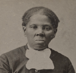
The article “Migrant Mothers” by George Dillard explores the story behind Dorothea Lange’s iconic photograph “Migrant Mother,” featuring Florence Thompson. It delves into Thompson’s life during the Great Depression and her mixed feelings about the photograph’s legacy. The piece highlights the role of Depression-era photography in shaping public perception and its engineered nature to evoke specific emotions. Teachers may find this article valuable for discussing the intersection of art, history, and social commentary, while encouraging students to critically analyze historical sources.
Why It’s Interesting:
- Includes photos of other "migrant mothers" taken by Lange
- Connects historical context with visual storytelling.
- Encourages critical thinking about documentary photography.
- Offers a personal narrative that humanizes historical events.
- All images available at LOC

I recently discovered HistoryMaps. It's a beautifully designed resource and available for free in 58 languages.
You can find it here: https://history-maps.com/
There are three main components of HistoryMaps: the Story Map, the Timeline, and the homepage’s global map. Each presents historical events in a different mode - either as immersive guided narratives, across time, or across geography.
Here's more from the creator:
Learn History Visually
When you show a map or a timeline, you know where things fit, both in time and place. Adding images and videos brings these stories to life; Visual Learning is intuitive, retentive and engaging!
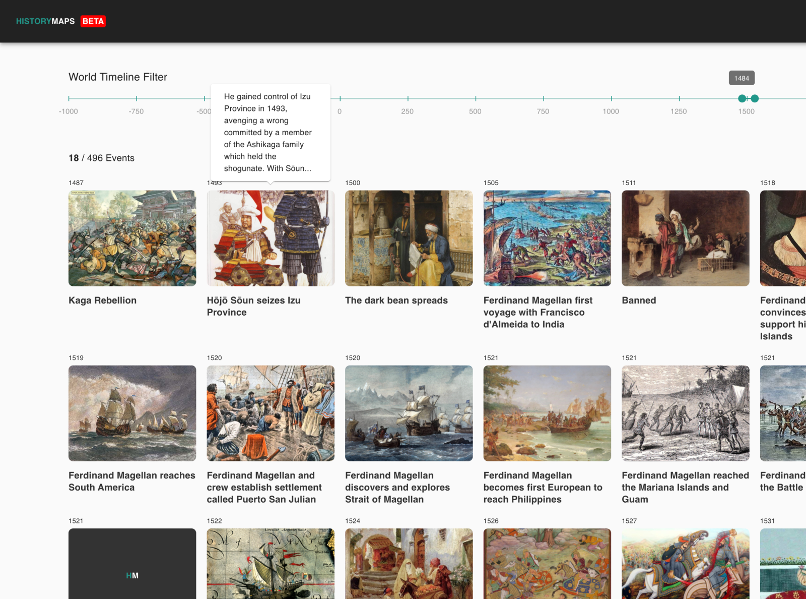
Comparative History
History is frequently taught as separate modules, like the history of Europe or the history of Asia, making it difficult to see how these different histories intersect and influence each other. With features like World History Timeline, you see events on a global timeline map. What events were unfolding in Japan when the Ottoman tribes were conquering Anatolia? Did you know that when the Romans invaded Britain in 43 CE, the Trung Sisters were establishing independence for Northern Vietnam from the Han Dynasty of China? Some of these events have no causal links, but some do.
Connect the Dots
Exploring history is like being a detective where you connect the dots between events, trace their causes and effects, and find patterns to uncover a story larger than the sum of its parts. Histograph is an AI-powered tool that helps you understand how historical events are interconnected, revealing how they can be both causes and effects of each other. For example, did the Battle of Varna have anything to do with the Partition of Poland? Or is the Haitian Revolution connected to the Louisiana Purchase?
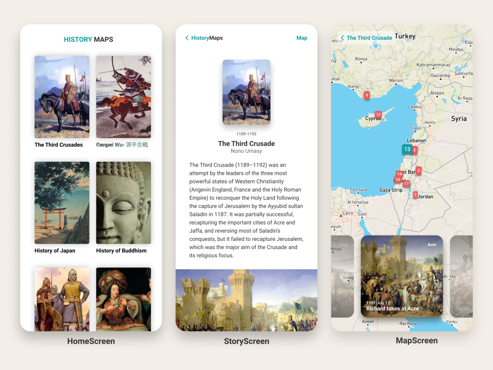
History for All
The site is available for free in 58 languages to make it accessible to as many people as possible. It's satisfying to see the content read in languages such as Uzbek, Vietnamese, and even Amharic (Ethiopia). Additionally, the site accommodates for the blind and visually-impaired users.

Great to see all you new pre-service teachers here in the "The Student as Historian" group
When I'm not posting as a TPS Mentor, I have another project at Substack called "The Forgotten Files" Each week I publish fascinating historical images drawn from a wide variety of archives - including the LOC. All artifacts are in the public domain and have a link back to sources.
The subject matter varies and sadly Substack does not include any tagging tools. But the search engine works well. Subscriptions are free - you can get new docs directly to your mailbox
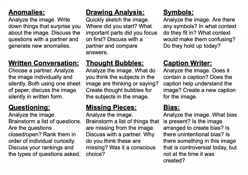
If you're looking for a quick lesson builder to use with the images use something from this flexible set of Historical Thinking Prompts from TPS Connect. (See below)
Engaging visual artifact + thinking prompt = a quick mini-lesson.
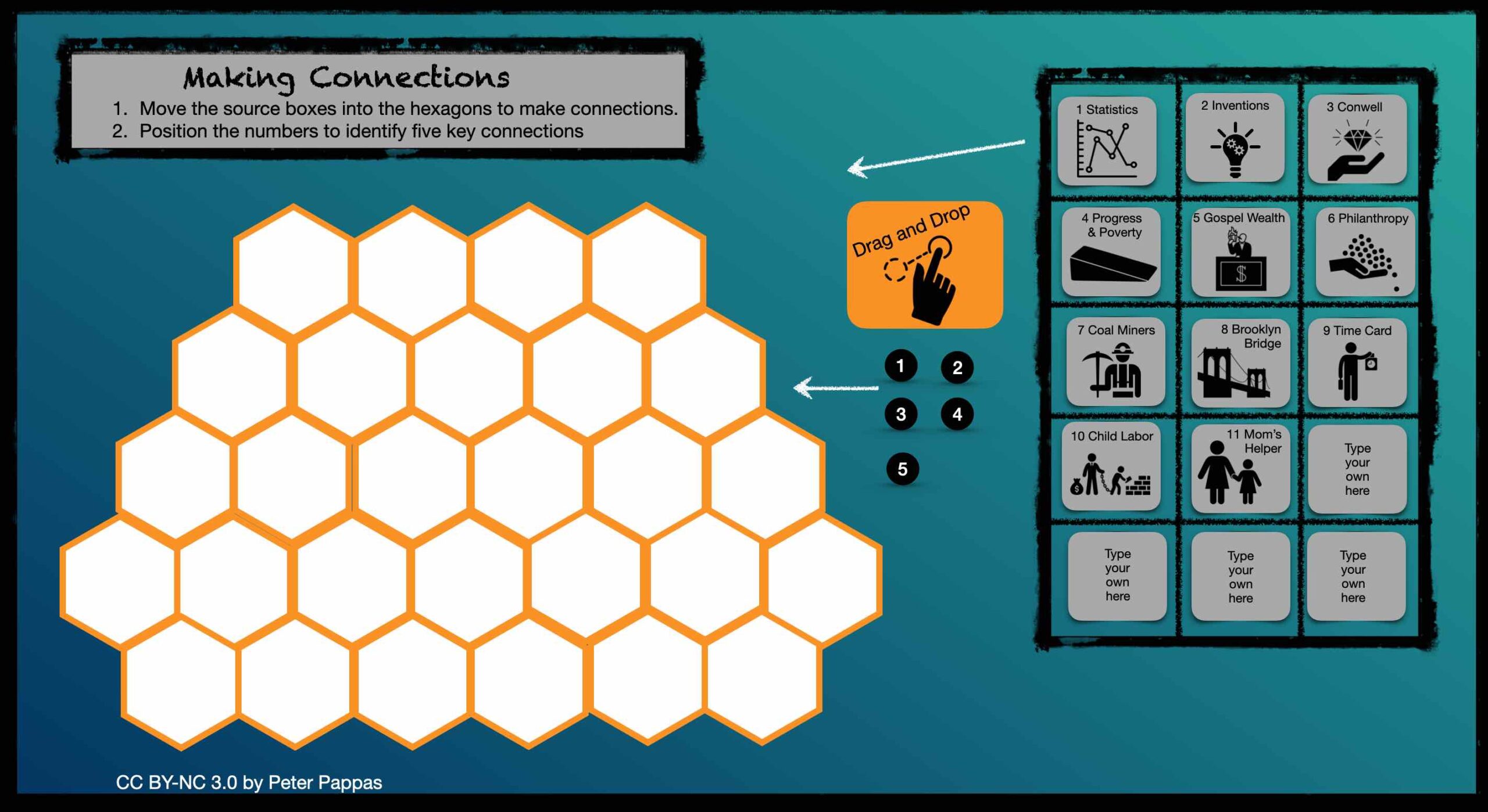
I have been teaching my pre-service social studies students historical thinking skills based on the work by Stanford History Education Group. (SHEG). I created – what I call a “Hexagonal Thinking Corroboration Tool” to help them work with corroboration skills. For content we used a selection of documents from the late 19th century curated around the them of rise of industrial America.
I’m sharing the idea to help teachers assist students in making connections. You can easily modify with new content boxes to match your instruction.
Download and copy Keynote file from Google Drive
In my Ed Methods class, students worked remotely in teams to explore the documents in my book, Progress and Poverty in Industrial America( available free at iTunes). Also available online as a Microsoft Sway. We used the 11 sources to create a graphic organizer that responds to the essential question: “How do we evaluate the social costs and benefits of technological innovations?”
This thinking tool was inspired by this post. Keynote design adapted from here.
Instructions:
Work with the members of your breakout group to corroborate the source readings.
- Move the source document boxes into spaces on the grid.
- Arrange the boxes so you can make connections between two or more source documents.
- When you have made an association between two or more documents, move one of numbers to that point
- Use the final slide to identify five key connections among the documents.
- Corroborate the sources in the connection and create an explanation of what you belief to be the most probable account.
PS. Here's a Google slides version of my “Hexagonal Thinking Corroboration Tool”

Progress and Poverty in Industrial America is my 18-page document-based question guides students through the historian’s process with an investigation of the essential question, “How do we evaluate the social costs and benefits of technological innovations?” To make the question relevant to students, it begins with a brief examination of the impact of 21st c technologies / global economy on progress and poverty in contemporary America.
Online overview here
Available as a free iBook here
And a web-based version here
Next the book turns to historic content set in late 19th century America. “Stop and think” prompts encourage a deep reading of many notables of the “Gilded Age” – including Russell Conwell, Henry George, Andrew Carnegie and Stephen Crane. Visual source material includes posters, 1908 Sears Catalogue, a gallery of photographs by Lewis Hine and video of one of Edison’s early Vitascope films.

Here's how my students used historical redlining maps and the 1940 Census to make a personal connection with government policies that fostered inequality and segregated nearly every major American city. Resources, how-to and sample student projects. https://peterpappas.com/2020/11/mapping-inequality-exploring-personal-history-in-redline-maps-and-the-1940-census.html redlining Census
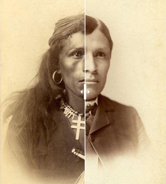
The Carlisle Indian School was founded in 1879 by Colonel RH Pratt. His method was to “drive the Indian” out of them. His motto “Kill the Indian, save the man.”
Here’s two photos of Tom Torlino, a Navaho who arrived at Carlisle a few years after it opened. The second photo shows Tom’s transformation. His lighter skin is most likely the intentional product of the photographer’s lighting.
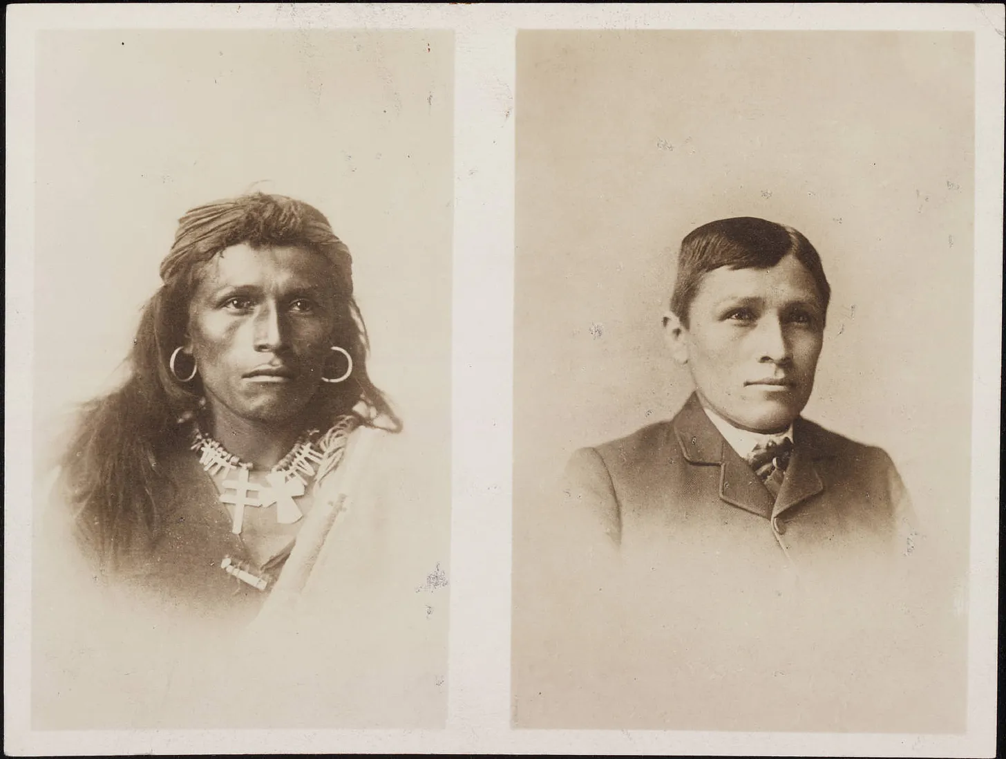
Before and after “contrast” photos were sent to officials in Washington, to potential charitable donors and to other reservations to recruit new students. Pratt’s photographs showing his "quick results" helped persuade Washington that he was doing vital work.
I’ve used Juxtapose JS to create an image slider. You can operate the slider and find more examples here.
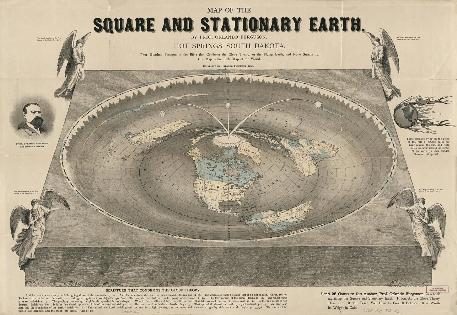
In 1893, Orlando Ferguson from Hot Springs, South Dakota, published a map of the Earth - which he claimed was flat, square and stationary. He asserted his model was supported by the Bible. High resolution image and more info here
The map found in the LOC, titled "Map of the Square and Stationary Earth" shows the world as a circular depression in a square block, with a mound in the center representing the North Pole. The continents and oceans are distorted to fit this shape, and the South Pole is replaced by a jagged ring of ice that forms the edge of the world.
The sun and moon are depicted as lamps that rotate around the North Pole on curved arms. The North Star stays fixed above the North Pole.
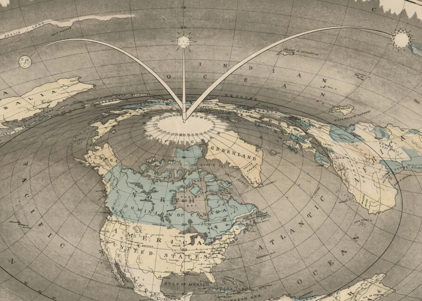
Ferguson asserted we couldn’t live on a spinning planet circling the Sun. To prove that point, his map included an illustration of people struggling to stay on an orbiting earth.
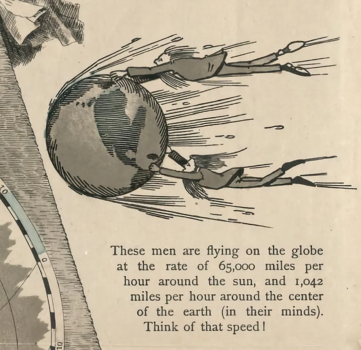
This fantastical map offers an opportunity to think about the challenges of representing a globe on a two dimensional map. Here's some questions you might use with students:
- What are some of the advantages and disadvantages of using a map or a globe to depict the Earth?
- How do maps and globes distort or simplify the reality of the Earth’s shape and features?
- How do maps and globes reflect the worldview and perspective of their creators and users?
- How does the shape of the Earth affect our understanding of ourselves and our place in the world?
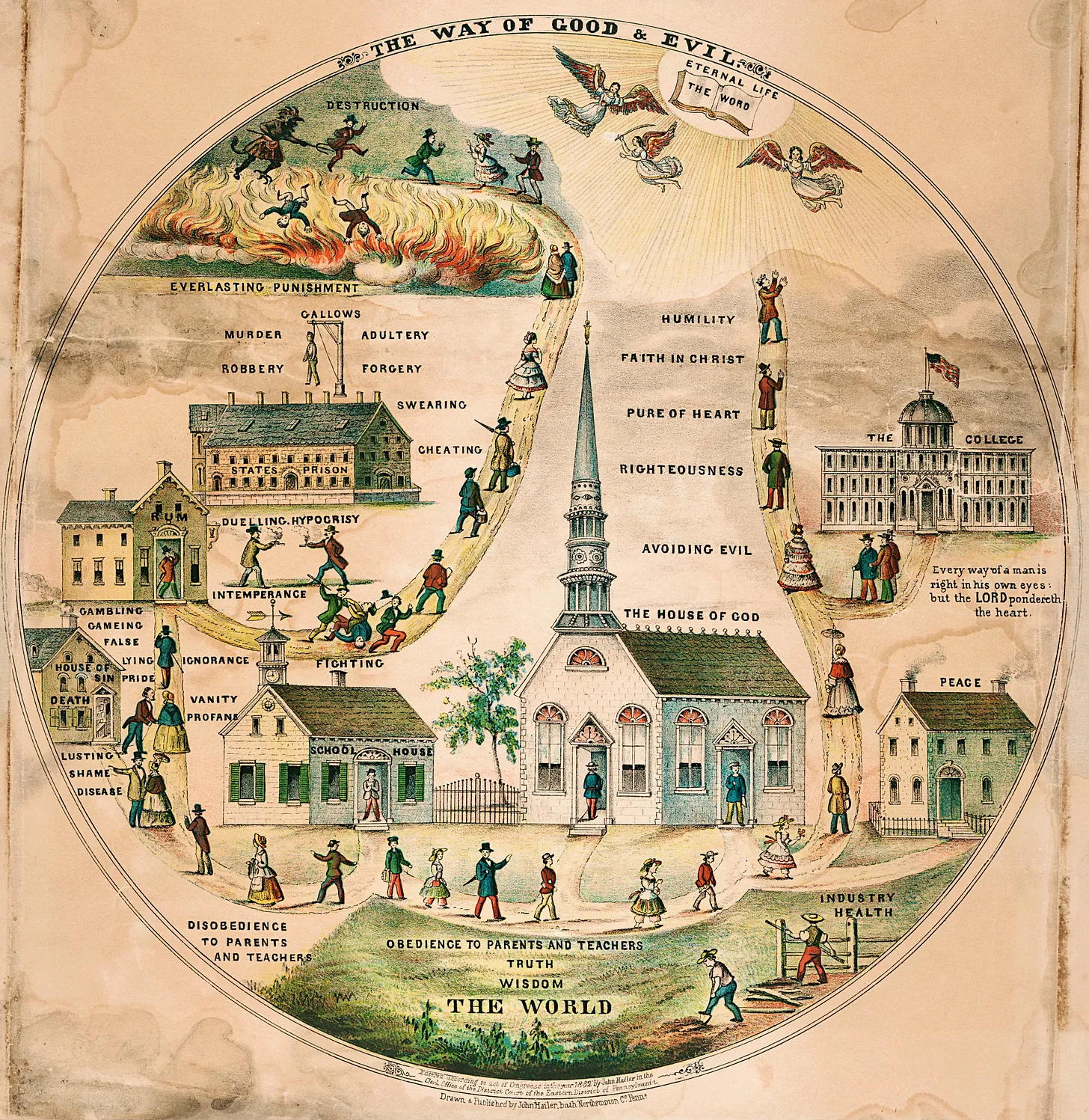
“The Way of Good and Evil”, drawn and published by John Hailer in 1862, is a circular allegorical image depicting the divergent paths of good and evil while on life’s journey. John Hailer was an artist and publisher who lived in Pennsylvania during the Civil War era. He created this image in 1862 as a moral guide for children, showing the consequences of choosing good or evil in life. ~ Higher resolution
The “Good path” features a church, a schoolhouse, a peaceful home, and a college with an American flag flying above it. It leads to Good and the Eternal Life through "The Word."
The “Bad path” starts with “disobedience to parents and teachers,” then to a House of Sin to a tavern, a States Prison to Destruction and Everlasting Punishment. The path to destruction ends with a pitchfork-wielding demon in the fires of Hell.
Discussion Questions:
- What is the central message of the image? How does the image convey this message?
- What are some of the characteristics of the good and evil paths? How are they different from each other?
- What are some of the influences or sources of the moral and religious values depicted in the image? How do they relate to the historical context of the antebellum period?
- How does the image reflect the views of the author and his audience? How might people from different backgrounds or perspectives interpret the image differently?
- How does the image compare or contrast with other moral or religious images or texts from the same or different periods? What are some similarities or differences?
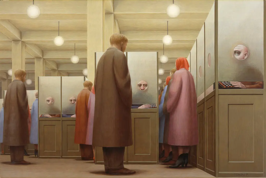
We’ve all grown accustomed to turning to search engines when struggling to remember a detail or fact. But recently I found myself in a situation where “Googling” was useless. I was trying to recall a work of art without knowing the artist, title, or even the country of origin.
Note: At some point in my life I had seen George Tooker’s “Government Bureau” (1956) – a striking image (above) that had burrowed into my memory. But I lacked the descriptors that would work in a traditional text-based search.
Armed with nothing but a vague sense of the era and the artwork’s elusive “feel,” I turned to Meta AI for assistance. What followed was a bit magical—a journey through memory cubicles that led me to the masterpiece I sought.
It began with this prompt ... see full post here
Testimonials
- I love that there is new info on the site daily!
- I had a wonderful time working with the Library of Congress and learning about all of the resources at my fingertips!
- The TPS Teachers Network has an equal exchange of ideas. You know it's not a place where you're being judged.
- My colleagues post incredibly fine resources and ideas....the caliber of the suggestions and resources make me feel that I take a lot from it. It's a takeaway. And I hope that I can give back as much as I get.
- Going into this school year, I have a fantastic new resource for my own instruction and to share with my colleagues!
- I am very glad that I discovered the TPS Teachers Network through RQI. Great resources can be hard to find out there on the internet!

