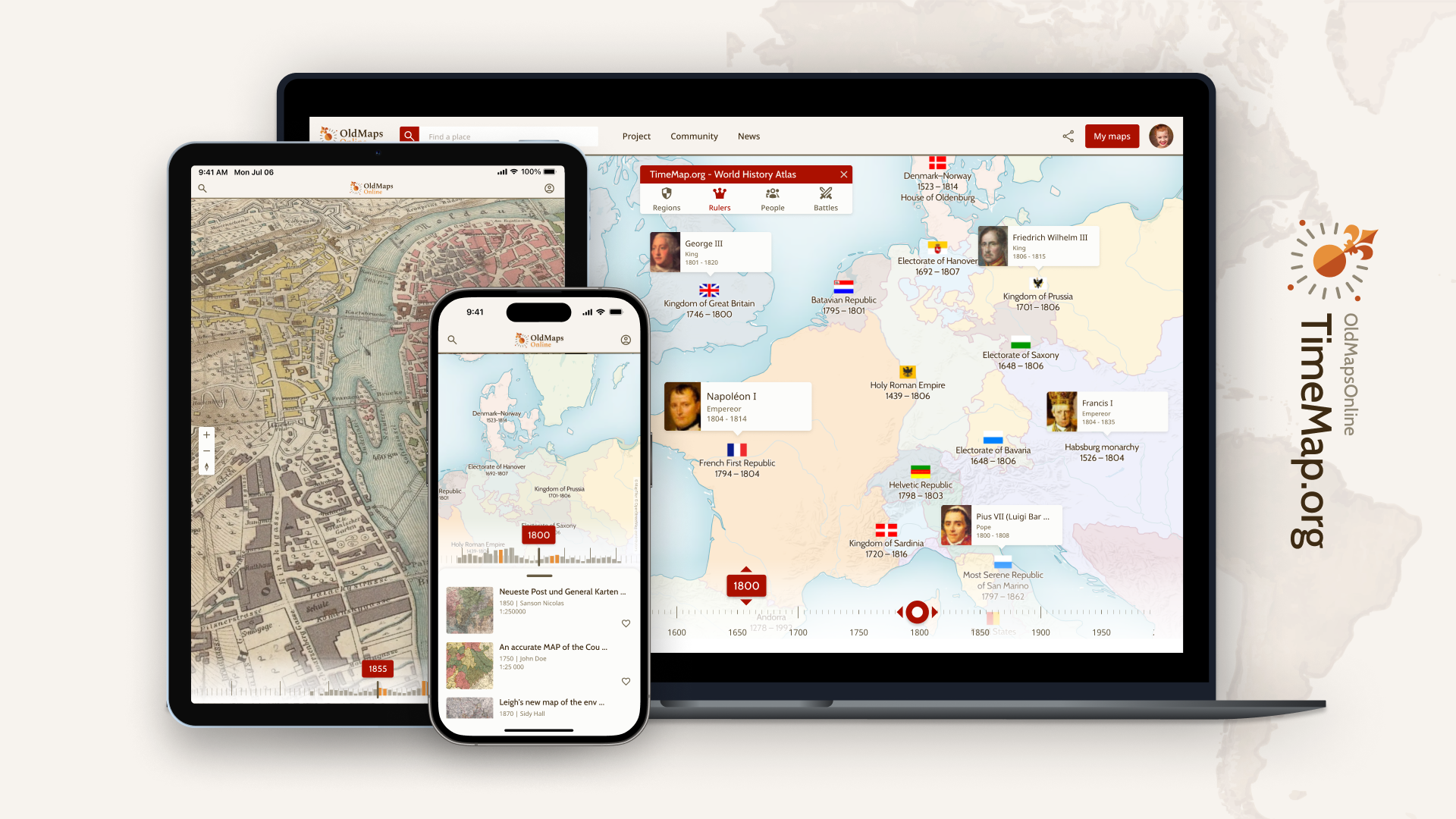
Looking for an engaging way to spark curiosity and critical thinking in your history classroom? Old Maps Online (oldmapsonline.org) is a treasure trove of historical maps that can bring the past to life for your students. This free resource allows you to explore thousands of digitized historical maps from collections around the world, and it’s perfect for integrating visual analysis into your lessons.
Classroom Ideas
1. Then and Now Comparison: Have students compare a historical map with a modern map to analyze urban growth, environmental changes, or boundary shifts.
2. Storytelling with Maps: Use maps as a springboard for student research projects. For example, examine a map of the 1800s United States and have students investigate westward expansion.
3. Critical Map Analysis: Encourage students to question maps as historical artifacts. Who made the map, and for what purpose? What can we infer about the mapmaker’s perspective?

Is it a Map? blog post by Julie Stoner includes some fascinating unusual infographic/chart/maps that defy a traditional description. How would your students begin to decode this primary source? I imagine listening to students grapple with the analysis process could be enlightening.
The others examples included in the post are equally compelling.

Would students possible use this map before or after studying the Civil War? It would take some time to make sense of all the information.

The third map doesn't seem related to the other two but again is unique and a challenge to figure out.
I did a search of "chart" in the Geography and Map collections and found some others items that might be of interest.


I encourage you to search the LOC collections for charts or graphics to see what you might find and share.
For those wanting a very deep dive into infographics, Data Visualization in Society,
a text published in 2020 might be just what you are looking for!
Two November blog posts highlight information on women in the workforce.
Illustrating Women's Work: Early Maps of the Women's Bureau, highlights advocacy for women, their working hours, conditions and wages. The colorful maps and graphics will be good analysis primary sources for students.

A related blog post from the Science, Technology and Business division, Women's Wartime Work may be a nice companion post about the Women's Bureau. Check out their guide Women in Business and the Workforce with lots of resources and links.

We can do it! Rosie the Riveter.
3 - 5 6 - 8 9 - 12 Art/Music Social Studies/History Technology Vocational/Technical Training
As we get closer to the Election of 2024, looking back at past campaigns and elections can help students see patterns and similarities to today.
Political Chart of the United States: Shewing the Progress, Reform or Sober Second Thoughts of the People compares the 1836 election of Martin Van Buren, the former Vice President over Benjamin Harrison with the 1840 election of Benjamin Harrison over Martin Van Buren. How many states were consistent from one election to the next? How many flipped? Research the social climate of the time and the issues facing the country and the candidates in 1836 and 1840. Students could compare the 2016 and 2020 elections and make predictions about the outcome in 2024.

Please share other thoughts and ideas.
You never know when you will come across something new and unique to then discover it has already been highlighted somewhere else.
I recently found the map titled Daily Mail world map of war and commerce while searching for maps of the world wars. A few days later, the Teacher Page folks posted a new Infomational Text Primary Sources Set...which included the same map. I had not thought of teaching it with an informational text angle for analysis, so it is always good to share ideas and look for entities that have used the same document from a different perspective or in a unique way.

The insets with many infographic icons will help students grasp the difference between the "Comparative Resources of the Belligerent Powers at the Outbreak of Hostilities". Could they recreate infographics of similar topics for current world conflicts?


Looking back at the Presidential campaigns of 1860 and 1864 might be a good way to discuss presidential campaigns and party platforms. These two documents include the platforms of the major parties and various other information. The 1864 document included biographical information on the candidates. What other information is included and why might it been added? How might you use these in the classroom to discuss the current campaigns for president of the United States? Can your students find the current platforms from each party? Are there similarities or differences to the platforms of 1860 and 1864?
What was the creator of these documents trying to convey? Do you notice any bias towards one candidate or another? How and where would the public have access to this information? Advertising in this time period is very different from today; how could voters decide on the accuracy and the source of information then and now.
Please share other thoughts and ideas on how you might use these primary sources.
I am president of the United States Board on Books for Young People (USBBY) this year and next, and I am about to leave for the Biennial IBBY Congress in Trieste. The only thing I knew about Trieste was that James Joyce had lived there, but I have learned that it is a place with a complicated history.
When I started poking around the Library of Congress, I found some wonderful images which capture its complex roots in the midst of geopolitical conflicts.
In a 1916 movie poster, "the woman symbolizes the city of Trieste, historically part of the Austro-Hungarian Empire and, during World War I, its main point of access to the sea. The Italian irredentist movement had been campaigning for the city's annexation since at least the last two decades of the 19th century. At the end of the war, in November 1918, the Royal Italian Army entered Trieste to the applause of the part of the population that favored the Italian cause. The army declared its seizure of the city and established a curfew. Annexation by Italy of Trieste and the surrounding region of Venezia Giulia was politically inevitable, but it was opposed by the newly-established Kingdom of the Serbs, Croats, and Slovenes, which also wanted to annex the city and its hinterland. The status of Trieste as an Italian city was affirmed by the 1920 Treaty of Rapallo. Annexation poisoned relations between the Italian and the Slovene populations, which at times boiled over into armed combat."

A 1923 stereoscopic image refers to Trieste as "the prize taken by Italy from Austria" and recounts the World War I-era conflict that led to its Italian status.
Into the 20th century, Trieste continued to be a cultural melange and a political hot potato, as an editorial cartoon demonstrates:
"At the end of World War II, both Italy and Yugoslavia claimed the port city of Trieste. In what was perhaps the first military offensive of the Cold War, Tito and his partisans invaded the area in March 1945. A peace treaty in 1947 established Trieste and the surrounding area as a Free Territory, but it was eventually divided between Yugoslavia and Italy."
This has me thinking a lot about places that have seen a lot of changes in governance -- more locally, the Alabama city of Mobile used to even display its six historical flags on its municipal flag.

And there is our northeastern state line, which follows the Tennessee River against the states of Georgia and Tennessee, the capriciousness of which has led to water claims on the part of Georgia.
Can you think of any other areas that have "changed hands" or where the border has been so contentious over time?

As we head into another election year, how might students use this map to analyze presidential elections, political parties and how the different geographic parts of the country voted?
A close look at the Explanation section, you can see how different political parties fared in each state by the coloring of the map. What significance does the immigration data have on the elections?
How does the information on miles of railroads impact an election? Why was that data included? What other details do you find curious? Why might the map maker included it?
Teachers may want to use this map with the following Hart-Bolton American History suffrage maps:


Compare and contrast the information from all three of these maps to get a better picture of who was allowed to vote, how that changed over time and how that may have impacted the elections in the past. How might these same factors impact the election in 2024?
Share your thoughts and ideas!
Sharing here an album devoted to learning about the Dismal Swamp and those individuals who found freedom there.

The map “Historical Geography” by John F. Smith was created during a time of intense national conflict over the issue of slavery in the United States. The map visually represents the ideological divide between the Northern states, which are labeled as representing “God’s Blessing Liberty,” and the Southern states, labeled as “God’s Curse Slavery.” It uses colors, lines, and labels to convey a strong message about the moral and political battle over slavery.
Historical Context
During the mid-19th century, the United States was deeply divided over the issue of slavery. The Mason-Dixon Line, depicted prominently in the map, was commonly regarded as the boundary between the free states of the North and the slave states of the South. This map is an example of how visual media was used to influence public opinion and shape the national debate over slavery.
By engaging with this map, students will develop their ability to critically analyze primary sources, understand historical perspectives, and appreciate the role of visual media in historical discourse. More background on the map and the era here
Guiding questions:
•What symbols, colors, and lines are used in the map?
•What messages are conveyed through these elements?
•How do the map’s design and content reflect the author’s viewpoint on liberty and slavery?
•Encourage students to think about who the intended audience might have been and what the map’s purpose was.
•How does the “Historical Geography” map reflect the historical tensions between the North and South?
•Evaluate the effectiveness of the map in persuading its audience about the issues of liberty and slavery.
•Compare this map to another historical artifact from the same period and discuss how both reflect the ideological battles of the time.
Testimonials
- I love that there is new info on the site daily!
- I had a wonderful time working with the Library of Congress and learning about all of the resources at my fingertips!
- The TPS Teachers Network has an equal exchange of ideas. You know it's not a place where you're being judged.
- My colleagues post incredibly fine resources and ideas....the caliber of the suggestions and resources make me feel that I take a lot from it. It's a takeaway. And I hope that I can give back as much as I get.
- Going into this school year, I have a fantastic new resource for my own instruction and to share with my colleagues!
- I am very glad that I discovered the TPS Teachers Network through RQI. Great resources can be hard to find out there on the internet!

